Ink Bloom is an innovative platform that aims to provide a comprehensive and vibrant community for writers to share their work, receive help with their writing scripts, and connect with peers and professionals. This is a start-up company and industry internship project based in San Francisco. I collaborated with three other excellent designers, Emily King (design lead), Emily Leopold, and Jason Xin, to proceed with iterations within a 30-day project timeline.
During this journey, we were responsible for participating in collaborative practices and activities such as brainstorming project plans, researching scripts, conducting user interviews and user testing, HMW statements, user flows, and wireframe ideation. My primary responsibility was analyzing user testing feedback and building the writer's Profile and UI components for the overall visual design. We all delivered the design output through the following design process.
.svg)
Since we were this project's phase 3 design team, our first activity was to meet our client and review all materials and work done by previous design teams to inform the project goal and anticipated deliverables. The client aimed to ensure the deliverables came up with the platform's MVPs and learn from new users about the price tiers, whether they would pay for the platform, and how much.
Depending on the last group's shared notes and slides, the existing design included desktop and mobile versions, but the completed high-fidelity prototype was mobile-only; however, the heuristic analysis samples deviate slightly from the prototype in terms of features, which has yet to be tested.
we decided to redo the heuristic analysis of industry samples and the current completed design (mobile version) to see what would be worth learning, keeping, or improving. We tend to run user testing on existing designs to reveal any critical problems that need iteration. At the same time, we drafted a to-do list for the research phase in our project plan.
We set up a research plan and recruited five potential users with creative writing experiences to participate in our user interview via posting a screen survey on social media groups. We brainstormed and organized all our ideas into one script, including user testing questions, so each member could stay on the same page and conduct the interview individually. The research goal was to identify what features users find most valuable, determine which aspects of the product to build out and pave a path to premium. We want to reveal existing usability problems as a reference to guide us in shaping the improvement for further design decisions.
(PS: The final survey and interview script were credited by Jason and Emily)
Meanwhile, we performed a heuristic analysis for industry samples such as ADPList, R/writing, and Wattpad for reference in prominent platform feature flows: Getting a critique, community, and sharing work. I also analyzed the existing design to screen the strengths and weaknesses to contribute to the audit for our team lead, who was in charge of the in-depth design audit.
(PS: Heuristic analysis of industry samples was credited by other teammates)
By collecting and summarizing everyone's notes from interviews, we generated the findings from our users and testing results. Additionally, through these interviews, we defined the platform's MVPs as the following:
(PS: The interview report and highlighting were credited by our design lead-Em)
My job was to synthesize all feedback into one report with the metric in the usability testing of the last design team's prototype. The testing goal for the existing design was to detect any usability problems users encountered and provide feedback to inform future iterated design decisions.
Based on our new findings and testing feedback from user interviews, all users preferred to use the desktop version after we showed and explained the desktop design at the end of the user testing session. So, we decided to proceed with the design to the Desktop version. Everyone contributed to some HMW statements, and our design lead determined similar statements that could be used to develop our design further. We also updated and prioritized the user stories of the previous groups, which concentrated on mentorship and community-related stories.

Due to the feature priority change, we reorganized the site's content into a sitemap and revised the navigation: Community, Search, Profile, and Critiques. Later, we refined the previous group's flows and produced new user flows by embracing missing content and monetization. (PS: The original sitemap was credited by Emily)

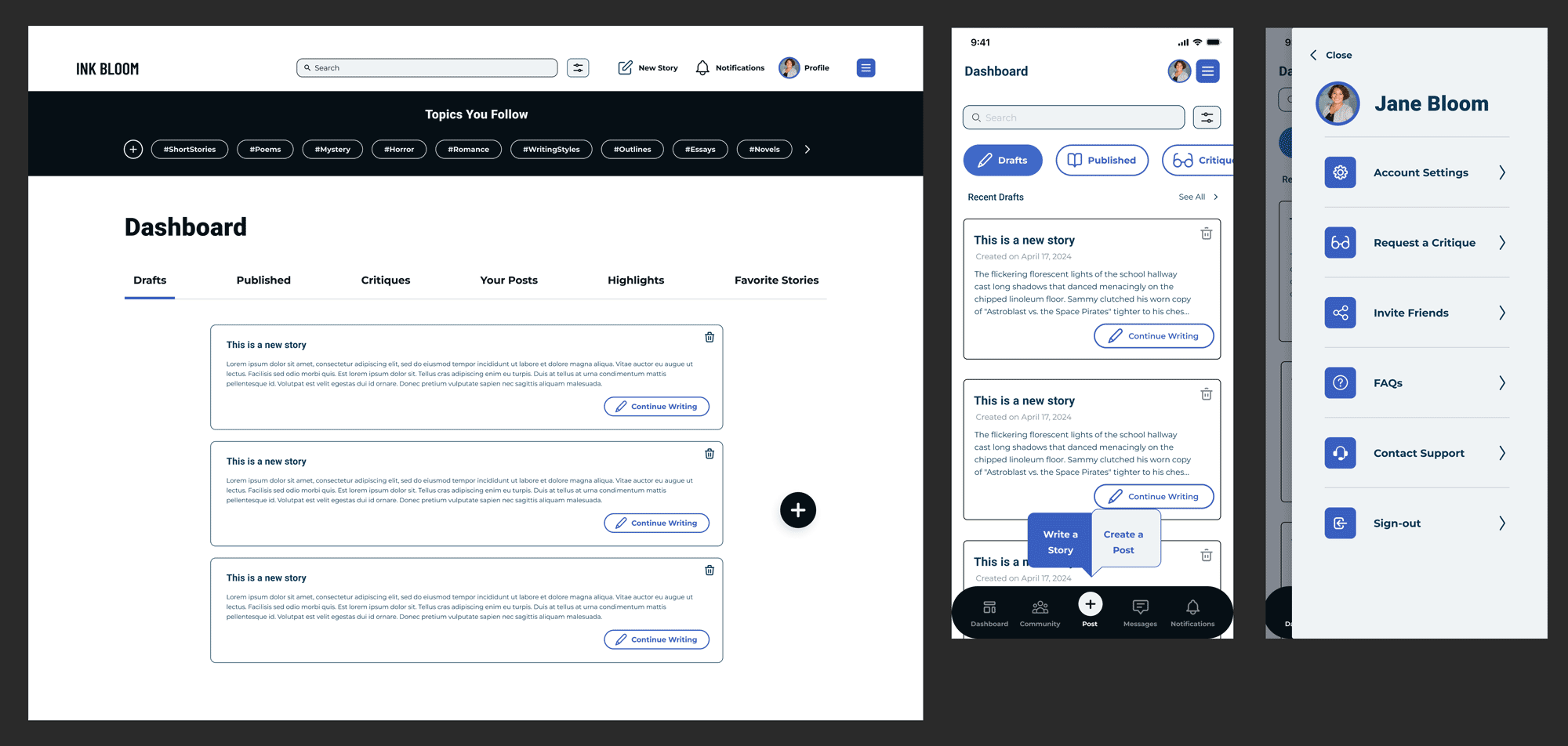
'Profile' belonged to one of the missing pieces of content, and it was essential for users to know more about other members so they could find like-minded people to connect with within the community. It also helps users who seek critique evaluate the right person and determine if they can give relevant support or suggestions on their work. My job was to build the 'Profile' page and execute the flow of creating a work via Profile.
To better ideate our wireframe of each flow and keep them consistent, we sketched and pasted our first thoughts for the platform and main navigation pages individually as a team workroom on Figma. We discussed each one's sketches and determined the final navigation layout for our following prototype designs.
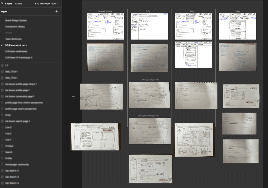
To ensure the highest consistency on screens and speed up our workflow, I shared a reference UI kit with the team, and we all applied this to help us build the wireframes for our user flows. At the same time, we independently made our flow screens into a low-fidelity prototype, and our team lead linked all the screens to prepare our low-fidelity usability testing.
We severally conducted the low-fi usability testing with five potential users remotely using the same script, and we aimed to get early feedback to validate our proposition below our new user studies and findings. We synthesized and summarized all notes into one document and prioritized critical usability issues for each flow. (PS: The low-fidelity testing report was credited by Emily)
All users found the new site organization extremely clear and intuitive. It increased the value of the original prototype and provided necessary additional flows and content. For my flow of 'Profile,' users were delighted with having all information accessible in one place and greatly valued the top section, including “About,” “Favorite books,” and writer tags, for determining if their tastes align with other users.

Although the last group created a UI library, it came with accessibility, consistency, and standards issues from the audit notes regarding interface style. Moreover, the priority of some features’ locations has changed, which means we need to optimize the UI styles and components to maximize the approach to our latest studies from the users.
We still used the original style guide's font and color theme but extended the color palette from the brand's component colors and refined the greyscale colors as the majority updates. We made these changes to enhance the interface's visual hierarchy and ensure the text complied with accessibility on the screens with a white background. We also unified the text line heights and added responsible and reusable components. (PS: The new color palette was credited by Em and me)
I contributed about 85% to building responsible components for our team, which helped the team easily apply and increase the effectiveness and consistency of the high-fidelity design process.


Since we were done with the high-fidelity screens, we recruited another 5 users to conduct a second usability test remotely. The testing goal was to validate that our high-fidelity prototype had solved most usability issues from the last testing and revealed potential problems or inconsistencies on the interfaces. As we did in our low-fi testing, we synthesized all notes into a single document and listed new finding issues for each flow. (PS: The high-fidelity testing report was credited by Jason)
All users felt comfortable navigating to all pages and flows. They recognized the site's features and appreciated the minimalist design. However, a few issues remain to be addressed, mainly embodying the copy text, such as 'published' and 'review rating' on the Profile page. To tackle those issues, one of our teammates became a copywriter to check all text on screens to ensure 'comprehension.'
All users strongly desire to use the platform if it goes live; they believe the community will engage them and help them find like-minded peers to connect with and get professional guidance. Additionally, our client appreciates all the efforts and deliverables that we made. Click here to see my flow's final design iteration prototype
I was grateful to be one of the contributors at Ink Bloom, a start-up company, and I enjoyed working with three talented designers as a team throughout the process. During this internship, I learned much from my teammates and recognized how we use our diverse strengths to complete a project together. Meanwhile, the strength of my teammates also reminded me to improve in the future.
In one of the collaborative activities, brainstorming interview questions, I learned from one of my teammates to draft her questions with non-leading questions. Although it may be related to personality, it is one of the soft skills I need to improve because the way of asking would cause limited answers and responses from our users.
Additionally, I was proud of how we found the problems to be solved through users' audits of existing designs. We eventually convinced our client to facilitate a new solution.
Ink Bloom was a continuing project, and it still has multiple content parts that need to be completed and sustainable features that need to be extended in the latest prototype. These include some edge cases, an onboarding section, nesting content pages such as filter and edit content of our flow screens, a payment process for the monetized feature, user rating systems, a mobile-friendly version, a notification feature page, messaging flow, etc.


