Tripack is a baggage assistance app that cultivates well-prepared and packed baggage for air travelers. In early research, packing behavior was crucial to baggage being overweight, oversized, or overpack upon departure. The goal is to design a solution aligned with the user-centered to relieve these sudden baggage circumstances before people attend the airport. I was responsible for the entire project's UX/UI design and worked extensively on research and analysis via different design phases.

To discover common obstacles people face regarding their packing experience, I conducted a quantitative study via Google Forms. The survey revealed that over 50% of 18 participants had experienced failed packaging. Most people drew into overpacking because of purchased commodities on return and packed the non-needed items or items not compliant with the airline's baggage policy on departure.

To better dive into other specific contexts and behaviors during the baggage packing process, I recruited 5 participants from the survey to remotely conduct in-depth interviews. I sorted the notes into diverse themes and patterns and generated a JTBD framework. I executed JBTD instead of persona because all participants comprehensively have similar and identical packing behaviors and experiences. Finally, I found several dominant insights and patterns from this qualitative study by the following:
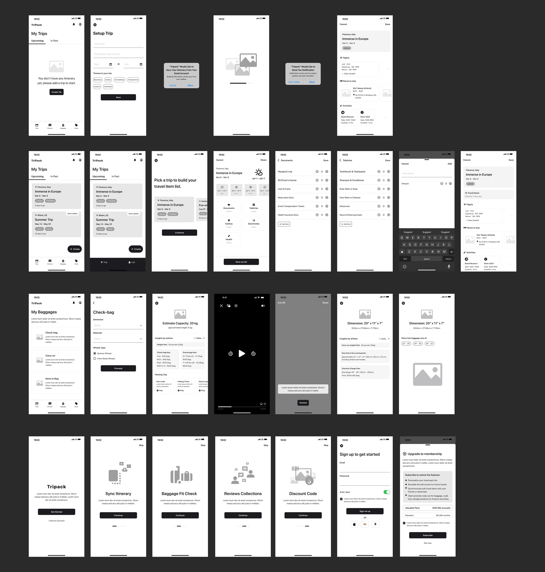
Embracing the insight tokens from qualitative research, I used the HMW statements to develop a user story map and generated the MVP with the MoSCoW matrix based on the features they may want to encounter using the app. The user stories and MVP included synchronizing the itinerary, a travel item list, airlines' baggage info, packing tips, and digital size measuring for bag cases and items.

I searched for competitors offering similar features or industries and filtered into LuggageScale, Tripsy, and Pack Repeat. Then, I conducted a heuristic analysis of competitors, highlighted a few perspectives (Match Between the System and the Real World, Recognition Rather than Recall, User Control and Freedom) to audit, and learned the strengths and weaknesses in the usability of interfaces and functions that most approximate my MVP. Based on the analysis, I listed a few functions as the main navigation to craft the sitemap, they were Trips, Discover, Baggage, and List.
To further validate my initial thoughts and ensure they aligned with the user-centered principle, I conducted an online card sorting, a tool called Optimal Sort, to run closed-card practice by offering pre-set groups and particular jobs to see if the navigation makes sense to users.
The finding showed that the 'Trip' and 'Baggage' jobs worked well because most people put those MVP jobs. After all, most people put that MVP job into the right groups. Still, people thought the primary job of 'Discover' was to offer various information about the place, such as reviews of the destination or packing tips, which means that anything would be involved in this group. The 'List' can also be part of the trip set procedure, although it was to create a travel item list.
To iterate the navigation, I changed' Discover' to' Reviews' to present more accurate information and jobs, and I merged the 'List' nav into the 'Trip.' In addition, in profitable consideration of the platform's business. I added another nav item, 'Deal.', to provide a channel for users to purchase baggage and accessories, which could be used as a membership benefit and product profit through partnerships and collaboration with third-party vendors or platforms. The ultimate navigation was Trips, Reviews, Baggage, and Deals.

To discover usability problems of the red routes and user flows in the early stages of design creativity, I conducted remote guerrilla usability testing on my sketches and user flows with five people from my network.


The finding revealed two routes that needed improvement. I executed my iteration on the medium-high wireframes because it was better for me to define detailed page content, nesting features, and layout. It also reminded me to build the edge case of the interfaces and clarify the wire flows of my user flows.
In the interface mockup section, I started on fundamental components such as color, fonts, icons, buttons, and forms such as cards, lists, drop-downs, etc., to build up the stylesheet and facilitate systematic design for the project. To make the design live, neutral, and emotional, I built a few interactive components while applying the style guide to all red route screens in my design; I built an initial high-fidelity prototype to validate the designs' usability and performance.
To discover any usability problems, I recruited five participants from previous interviewers and remotely ran a moderated usability testing with assigned scenarios for my initial high-fi prototype. The objectives are to uncover the significant usability problems in the current three red routes, such as the efficiency of completed assigned tasks, reveal vague text content on screens, and validate the design consistency of interfaces. Click to see all materials applied to this testing
During the session and findings, I identified several critical usability issues in some tasks and screens, including vague content, page entrance, non-neutral content text to humans, and heavy prompt text. I also summarized the findings as a testing report and iterated the interfaces to update my high-fidelity prototype.
All users appreciate the digital measurement of their baggage and item size. Still, some anticipate the simulation if they can also view how their carry-on bag size fits into the aircraft bin. Moreover, they like the destination reviews. They mentioned that spending in location reviews was valuable in helping them keep their travel spending in mind even though it is not clickable now.
Although it was a limited budget for an academic project, I released my quantitative study via link share on SurveyCircle and Facebook public page to seek potential users. Without the constraints, I would also like to use online testing tools such as 'UserTesting.com,' 'TryMyUI' or 'Lookback' to run unmoderated usability testing for my iterated prototypes because it could help me to receive extensive insights without someone leading the session. It was better for me to improve the interfaces for following subsequent iterations.
On the other hand, a few participants from the first high-fi usability testing tend to import the itinerary manually. An essential fact of human beings is that when people ask for permission on screens, they think seamlessly. Some people may not be want to allowed to share individual information passively through their mailboxes, which enhances User Control and Freedom to adhere to the NNG Heuristic Evaluation. So, I had to set this prototype and test it later, although I had finished those screens and wire-flow in the earlier stage.
To continue working on the project, I will dig into the backlog MVPs from the user stores mapping because they are also essential features related to the empathy section. It is necessary to ensure every content interaction aligns with the entire user-centered and tends to shape the project into a product perspective mindset; moreover, the execution was also critical to know about the developing time and spending while working on the backlog features.
Click here to see the project presentation